Celebrity Color Analysis // Whitney Port
In this series, we look at celebrities' color choices. Have you ever wondered, why a celebrity looks so flawless? Often their "glow-up" is only based on a good stylist and the right color choices.
Who is Whitney Port?
Whitney Port is a multi-talented American fashion designer, television personality, and author. She rose to fame through her appearances on reality TV shows such as "The Hills" and "The City". After gaining recognition on these shows, Whitney launched her fashion line, "Whitney Eve," and worked with renowned fashion designer Diane von Furstenberg.
In addition to her fashion endeavors, Whitney has also dabbled in acting and appeared on various TV shows. She is also a published author, with her book "True Whit: Designing a Life of Style, Beauty, and Fun" being released in 2011.
Whitney's personal life has also been in the spotlight, particularly her relationship with her husband Tim Rosenman, whom she met on her reality series set. The couple engaged in 2013 and tied the knot in a beautiful wedding ceremony. They also work together on Whitney's YouTube Channel "Whitney Port" and Podcast "With Whit".
What colors does Whitney Port wear right now?
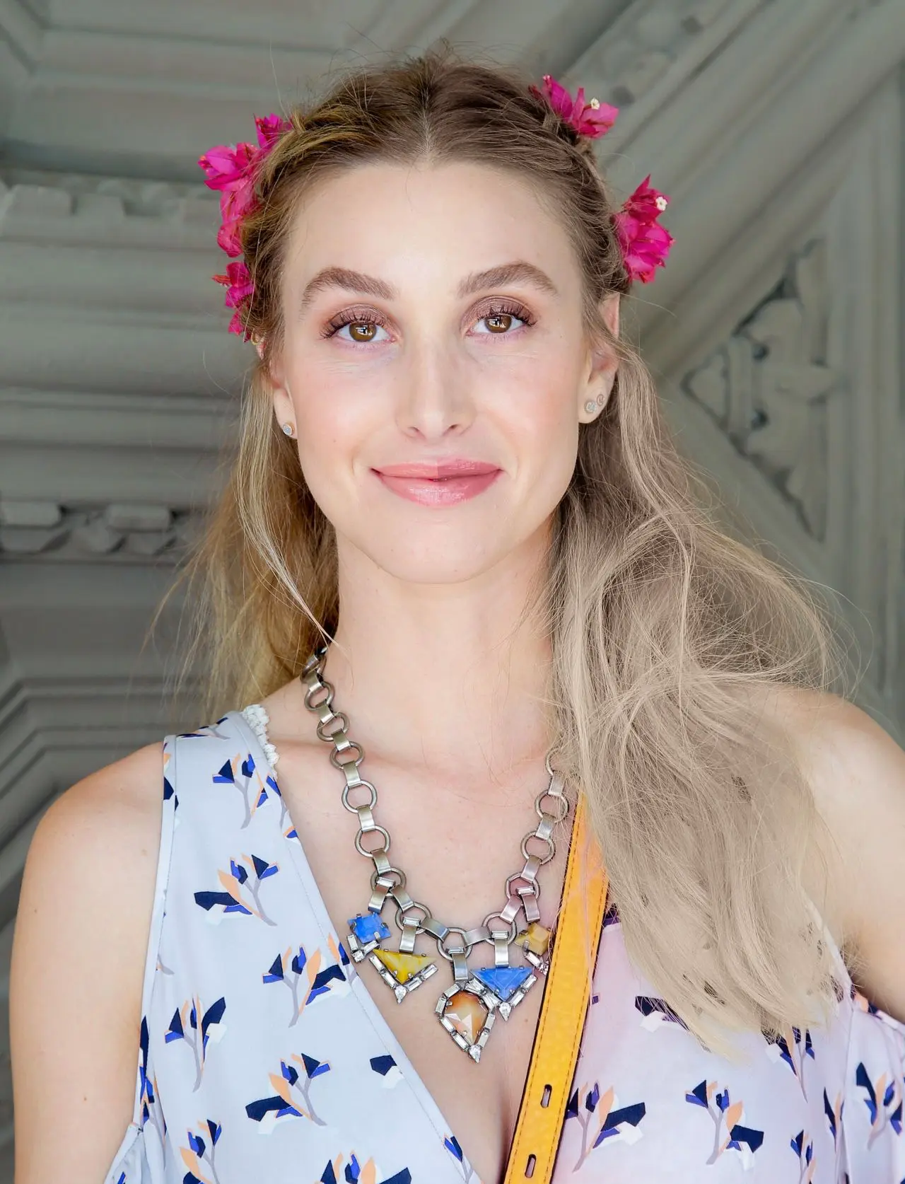
Whitney's personal style is all over the place, as she likes to experiment. She wears all colors, but often black and white as neutral colors. Her style is oversized and comfy with chunky sweaters and casual, athleisure styles. She usually styles something with a twist for events.
Her natural color is dark blond to light brown, which she usually dies blonder. Her eye color is brown and she loves wearing no-makeup makeup and makeup products with a neutral palette.
Cool vs. Warm
Photos by Celebmafia
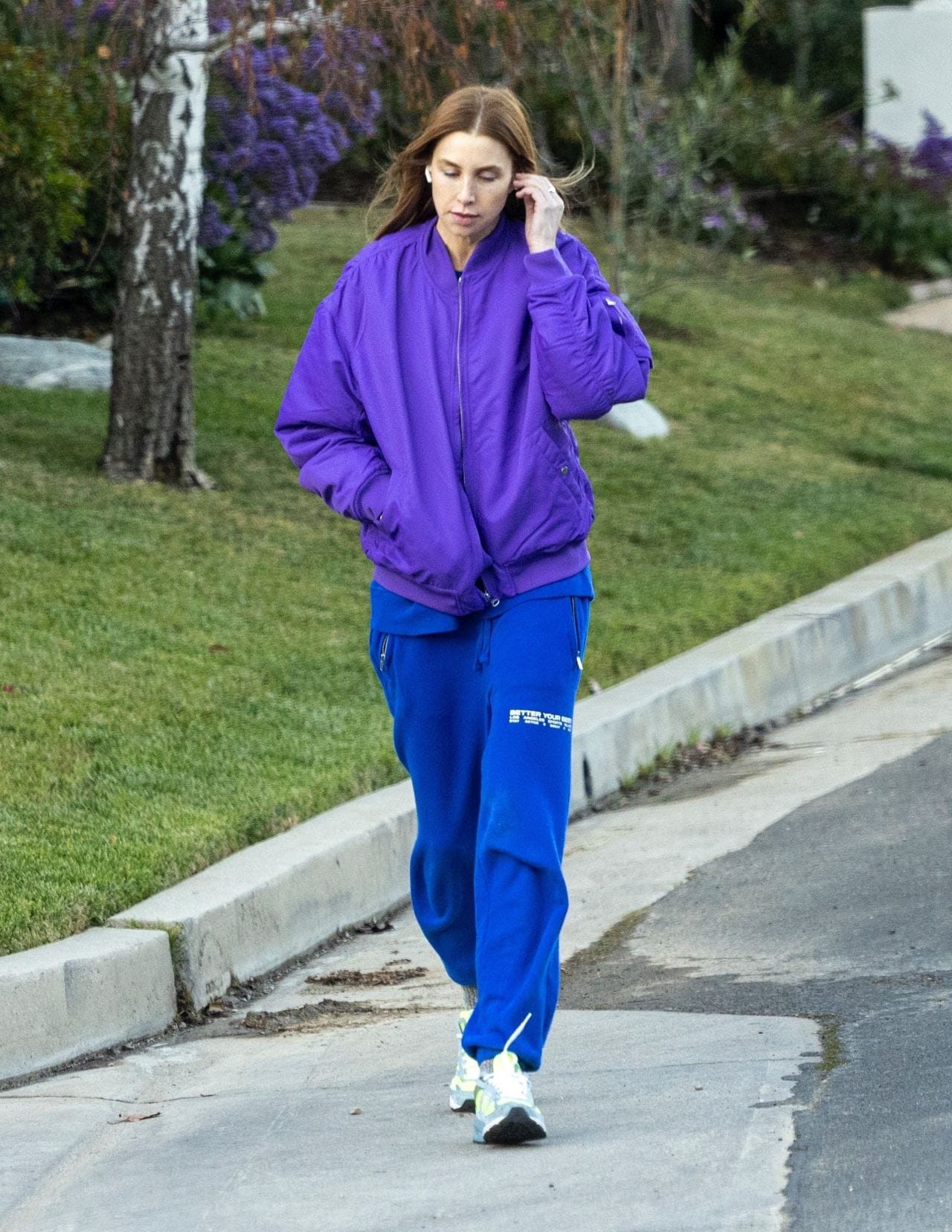
First, let's compare cool colors against warm colors. Does Whitney look better in cool colors like white, blues, and silver or warm colors like ivory, olive, and gold? On the left, you see Whitney in a violet bomber jacket with royal blue track pants. The contrast of her outfit is too intense and her dyed hair color is too warm for her and looks off.
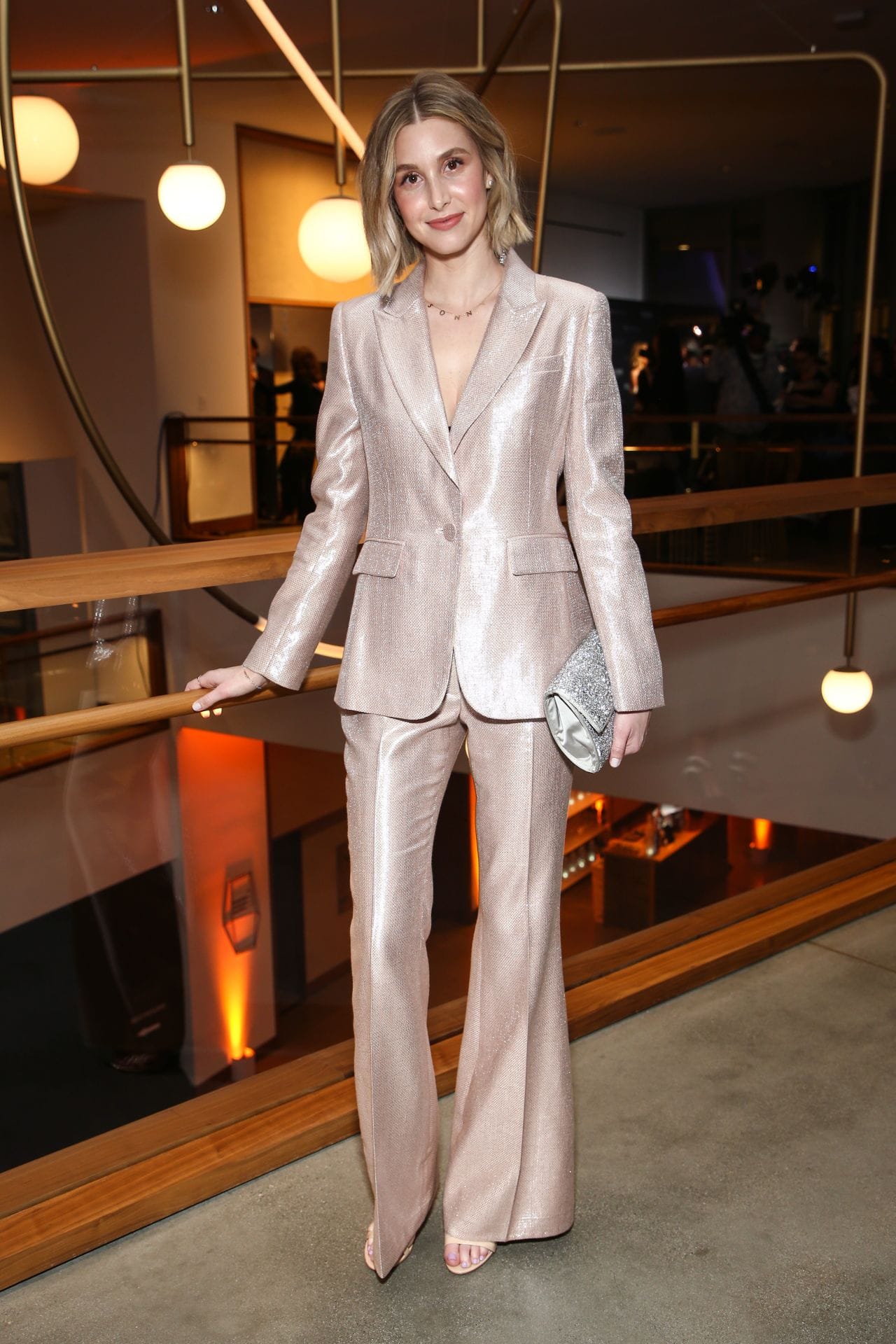
On the right, Whitney Port wears a champagne-colored suit. This color is a little bit too light for her and makes her look pale and her skin yellowish.
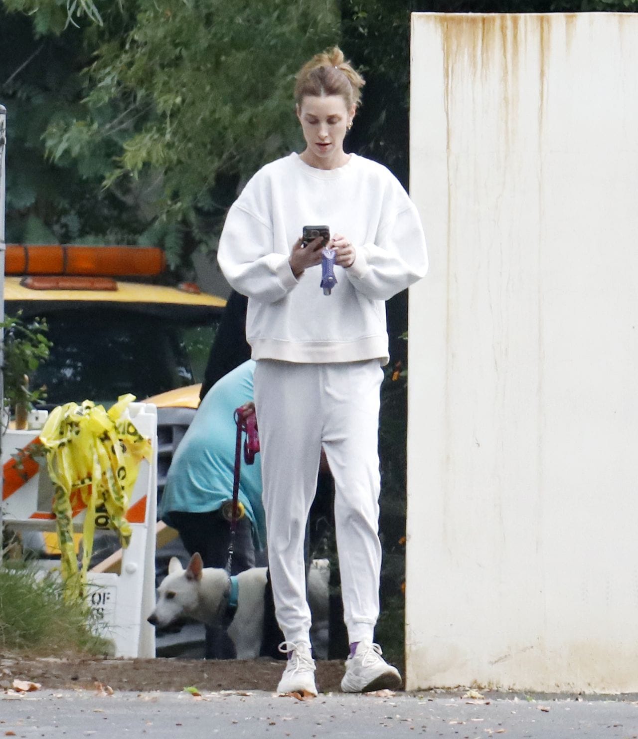
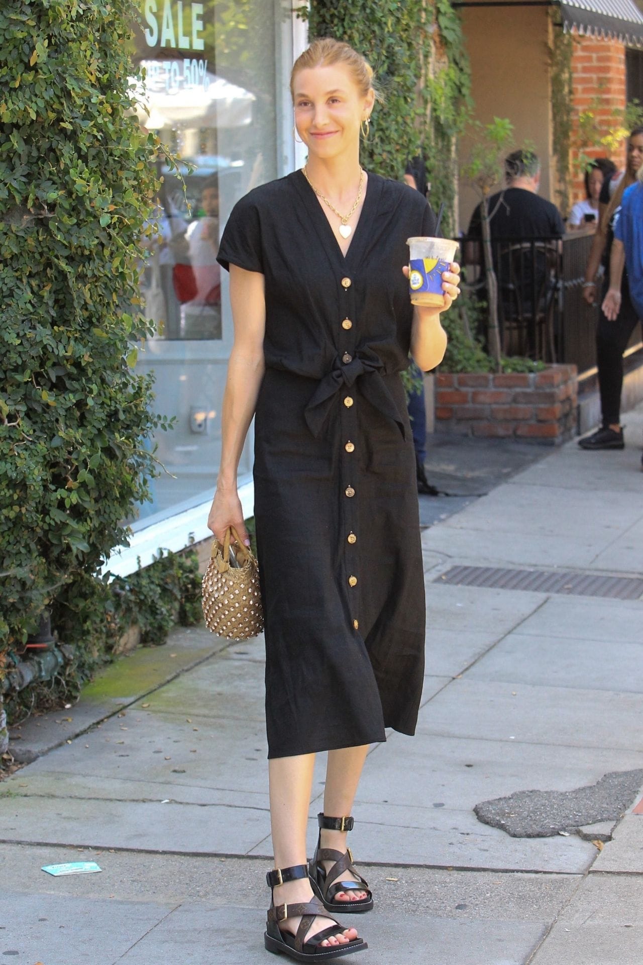
Light vs. Dark
Photos by CelebmafiaCelebmafia
Next, let's compare if lighter or darker colors flatter Whitney more. On the left, she wears an almost white sweater with a matching jogger. She usually looks very pale in light clothing and sick.
On the right, Whitney wears a black dress. You probably look first at her dress, because it steals the attention away from her facial features. She has almost no contrast between her hair and her skin, which lets the dress take too much attention. As both extremes don't flatter her, medium colors are probably the best way to go.
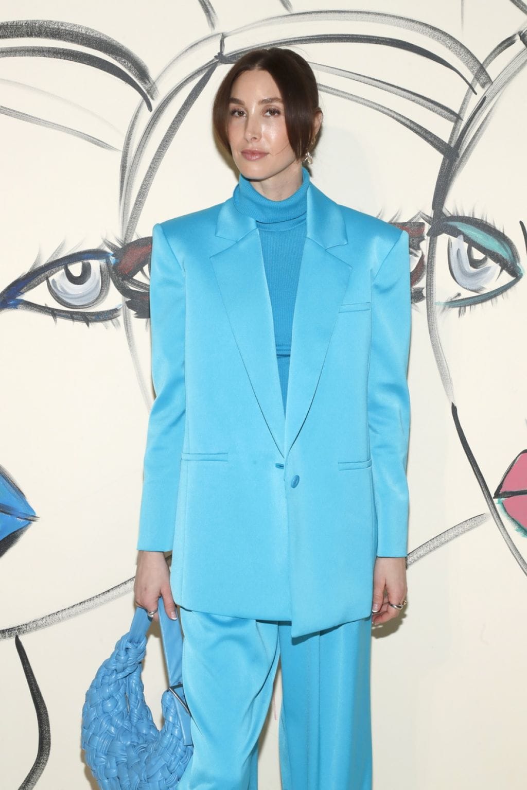
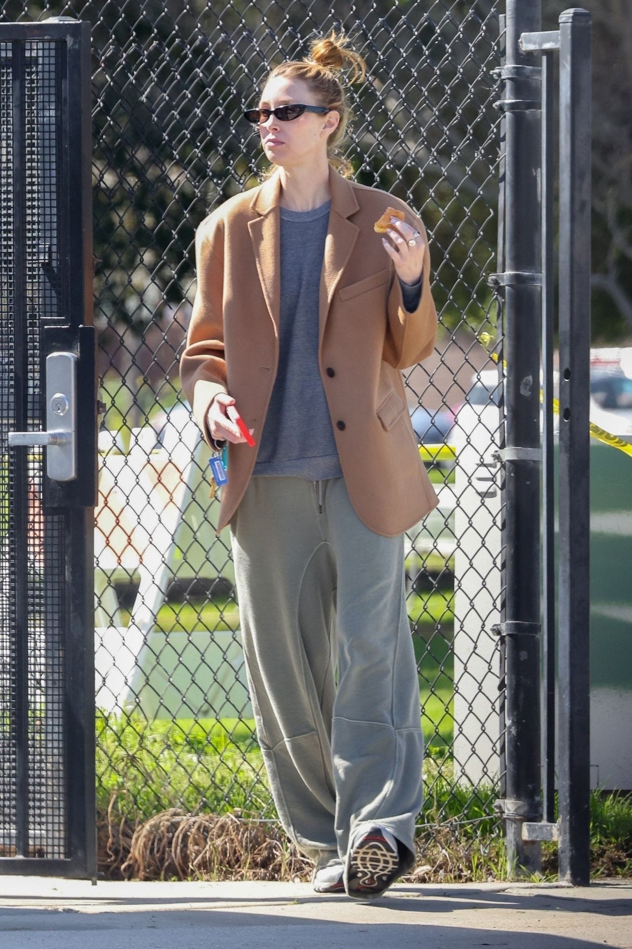
Bright vs. Muted
Photos by Celebmafia
Finally, let's compare bright against muted colors for Whitney. On the left, Whitney wears a bright blue outfit as well as dark hair. This much contrast from her hair and clothes takes the attention away from her face.
On the right, Whitney Port wears a brown jacket, with a greyish shirt, which looks more flattering on her. Her hair clashes with her skin color, as it is dyed in a warm orange-blonde color.
Finally, which Color Season is Whitney Port?
In conclusion, Whitney Port suits cool and muted colors best. It is unimportant, if she wears lighter or darker color palettes, as she falls more into the medium range with them. I think, her primary color aspect is muted, which makes Whitney a ☀️ Soft Summer Season. Just look how beautiful she would look with less warm hair and softer patterns!